Boasting a seamless browsing experience
Ensuring a user is well covered with insurance all around

Role
UX Designer in a team of 5 designers with 1 Project Manger
Timeline
5 Months of involvement
May 2021 - Nov 2021
Contributions
User interface design, User flows, Requirement gathering workshop, Feature prioritisation

Background
Tata Sky is an India based telecom service with a wide breadth of coverage and loyal customers. Binge being one of its product which has a freemium business model, it has gained a decent amount of users. Now Accedo has been contracted as a design vendor to improve the user experience of the application and give it a reskin for a more modern look.

Problem
High friction for management of account
Navigation of the app to unsubscribe, switch plans and log out of the app; even requiring users to go down to the store to unsubscribe
Non-intuitive way of browsing of shows
Fixed and restrictive way of filtering and browsing of the shows.

Due to limited understanding of the India market, thankfully we were working with our Accedo India counterparts, and they were able to provide relevant assumptions to help with our design.

Geographical differences
When collaborating with the India team, I discovered significant gaps in our understanding of local user contexts due to regional device preferences and usage patterns
1️⃣ iPhone may appears too premium for locals
2️⃣ Android is something they are more familiar with

Show information and information density
Indian users demonstrated a notable preference for information density, expressing comfort with advertising content and a desire for more comprehensive information within single views.
Key is in empowering the users
Users express frustration in navigating the application and being unable to perform a lot of basic features, which creates significant user friction when not easily accessible.
1️⃣ Setting parental locks to control children's streaming time
2️⃣ Locating the logout button

We had to narrow down our scope to focus on improving the experience on specific areas in the app instead of tackling it all at once leading to the following points of focus:
Improve the browsing experience
The platform offered minimal personalization despite hosting content in over 20 Indian languages, making it extremely difficult for users to discover relevant programming.
Additionally, the limited filtering options for categories, genres, and top content further complicated the content discovery process.
Account management
After discovering that critical features were buried deep within nested settings menus, I collaborated with my senior designer to restructure the account settings information architecture.
We created comprehensive screen flows that both streamlined user access to information and provided developers with clearer documentation for implementation.
Solution
We had multiple cross collaborations design critiques and reviews with the India Tata Sky team before finalising the designs
Click on images below to get a clearer view and explainer on the design decisions.
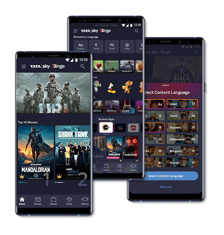
Design Solution 1
Improving the browsing Experience
💡 Optimised filter features with different ways of filtering the shows with user preferred categories
💡Improved keyword search feature with better recommendations from the searches
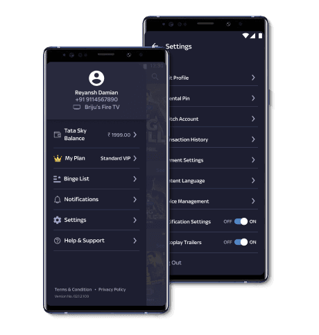
Design Solution 2
Intuitive account management and personalisation
💡 Ease of access to features to manage their accounts and updating of preferences
💡 Prioritised the information architecture and accessibility of these features through reworking of the information architecture and introduction of side menu

Retrospective
A redesign of the app is not as simple as it seems as it typically stems from a problem that has been identified

Understanding geographic and cultural differences
Geographical design variations offer profound insights that have guided my approach throughout my career across multiple organisations. These cultural nuances continue to shape and enrich my professional perspective.
Balancing business goals and a good experience
Creating thoughtful friction for business-critical moments like unsubscribing or logging out while maintaining an overall seamless user experience is about finding the delicate balance between business objectives and user satisfaction

Back to top
